To start my contents page I first added a box by using the rectangle marque tool I then used the paint bucket tool to make it blue I also put the box at a angle.


For
the next part of constructing my magazine I added a box with the rectangle marque tool then used the paint bucket tool to make it white I then put it over the top of the
blue box.


I now start adding text to my contents page and the first bit of text I added was" Inside the Mag", I used this text as pop magazine contents pages don't really use the word content and by doing this was following the same common conventions.
For this step added my masthead from the cover page because most pop magazines include the cover page masthead on the contents page. I also used the rectangle marque tool and the bucket tool to make a orange box at the bottom of the contents page.

For
the next step I added four images of each member of the band and put each image
in inside one of the white boxes I made in the last step.


For this step I got a star brush of brusheezy and put it on the orange box.


 I then added the page numbers into the rest of the yellow circles by using the horizontal text tool.
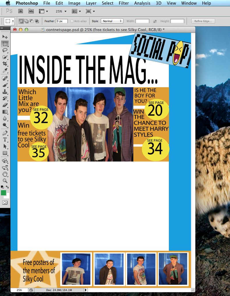
I then added three more parts of text by using the horizontal text tool I placed them into the three of the four empty boxes.
 I
then added a yellow transparent box by using the rectangle marque tool and the paint bucket tool to make a yellow box, I then changed the layer setting to overlay. I then used the Horizontal text tool to put the page number for the main story on top of the transparent box.
I
then added a yellow transparent box by using the rectangle marque tool and the paint bucket tool to make a yellow box, I then changed the layer setting to overlay. I then used the Horizontal text tool to put the page number for the main story on top of the transparent box.
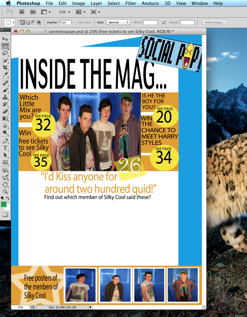
For
this stage I put the text for the main story and a brief sentences under the
main text telling the reader a little more information I did this by using the Horizontal text tool. The reason I made the main text orange is because the pop magazines I looked such as Top of the Pops and We Love Pop use different colors than black to make key information to make it stand out.


To finish my contents page I added the page numbers in a orange text to make them stand out and to follow the common convention I came across when looking at the Top of the Pop and We love Pop magazine contents pages where they use different colours to make there page numbers stand out.
After having a second look at my contents page I have made some changes because:
Spelling mistake.
The style of typography did not fit in with my genre of magazine.
And other reasons such as the colour pallet did not use pink.
What I have changed is the typography of some of the text, I have also used pink on my contents page so it follows common conventions used on a pop magazine.All the things I have changed have been so my contents page relates more to my target audience..
Below is my final design.

This comment has been removed by a blog administrator.
ReplyDeleteOn all of your construction posts you need to use more media terminology e.g. which Photoshop tools did you used and why? Also, say why it will attract/represent target audience (include youth/gender theory quotes) and say how you have followed conventions (refer to existing magazines you looked at).
ReplyDelete