
Thursday, 26 September 2013

Wednesday, 25 September 2013
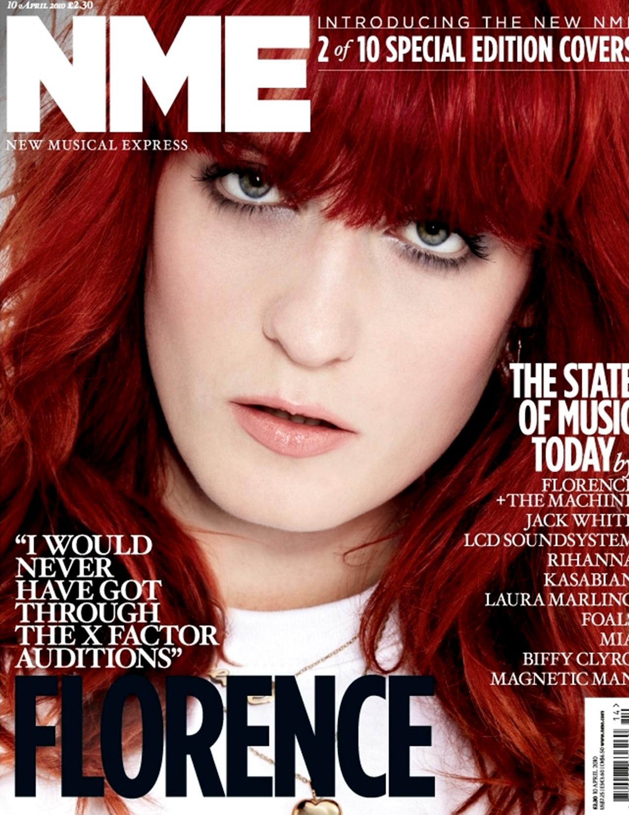
Original images

This is one of my images I took which I was thinking of using for my magazine cover page, however a thought it was to intense for my target audiences so I decided not to use it for my cover page.


This is the main image I choose to use for my contents page because I thought it fitted with the story of boy genius as he looks intelligent in the image unlike the image below.

I choose to use this image because it involves a person in very modern clear clothes which will appeal to the target audience, I also thought the background also went well with the music themed story.


I choose to use this image because I thought the lighting was very good and it looked really good with the story I also thought if I was to improve it I would make him wear a hoodie to fit in with stereotypes of hoodies being bad or trouble.As I did not use it it may appeal more to my audience as I have not used the stereotype.
Tuesday, 24 September 2013
Cover and Contents page flat plan

This is my cover page flat plan for my magazine cover based on my survey results.

Saturday, 21 September 2013
Audience research

However on the next chart it shows a balanced response as each of my 3 people chose a different answers so this could effect my results as it means I will have people from different backgrounds and social groups answering questions.

 Sadly as I got only 3 people to answer my survey all of them are male this could been that my magazine could end up appealing more to males than a mixed gender audience.However next time I will make sure to send my survey by email and Facebook so more people will get it and I will have more of mixed gender results. I will also try to get a whole class to fill it out to make sure I have some more mixed gender answers.
 In the next chart it shows me 2 out of the 3 of my people are Cornish so I will try to put a Cornish theme in my work, that could mean I have to take photos in Cornwall to pull in my target audience or it could mean I have to add a Cornish themed story or the Cornish flag on my magazine.


With this question I have made a mistake as I forgot the" like" in my question. However I do agree with the results as it tells me that the images are not good which I also think. One person also thought the colour was not up to scratch however I will focus more on the pictures as this was the main problem, picked out and then focus on the colour afterwards.


This question tells me that I need clear photos as 100% of the people answered by saying they would like to see clear photos. Also at 30% was clear text and images that relate to the target audiences. So first I need to include clear images and then clear text which is important to get people reading my magazine.I will also need photos that will relate to my audiences so I can pull in my target audiences of 11 to 19 year olds.
Thursday, 19 September 2013
Analysis of contents pages.
My Analysis
of Empire's contents page.
 In this analysis I will go through the key
conventions of a contents page. The target audiences of the magazine is people
between the age of 16 to 30 and is targeted at both genders. The
In this analysis I will go through the key
conventions of a contents page. The target audiences of the magazine is people
between the age of 16 to 30 and is targeted at both genders. The
majority of people reading the magazine will fall into the audience demographic at band B down to D this is due to it mainly talking about high end films by big companies and no small end films so it will appeal to high and lower classes.
The use of colour in the empire contents page is simple and only uses 3 colours black white and red it is where good combination because when I see red and white it all ways reminded me of vintage
cinemas and old popcorn boxes. I also
like how they have used red bold text to show the key parts of text and put the
less important text in white. I also like how the image has only just used the colour black, white and dark grey this includes all the objects in the image.
The use of semiotics is acceptable as they have used handcuffs to symbolise trouble. There is not much uses of images in the Empire
magazine as there is only one image of a women handcuffed which is a wide shot however they have used
the picture well as it is the focus of the page and helps keep a
structure to the context page. However I think it would have been better if it
had some smaller images to go alongside the stories. The use of iconography is very simple as the magazine has only used one image however they have used the image in a very effective way as it is the centre of attention on the page.
 In this analysis I will be
comparing this GQ magazine contents page along side the Empire magazine contents page. The magazine GQ also has
the target audience of 16 to 30 year olds however it is more targeted at men
but may also appeal to tom boys. The readers are around the social group of C1
to E however it could also appeal to sporty higher class people.
In this analysis I will be
comparing this GQ magazine contents page along side the Empire magazine contents page. The magazine GQ also has
the target audience of 16 to 30 year olds however it is more targeted at men
but may also appeal to tom boys. The readers are around the social group of C1
to E however it could also appeal to sporty higher class people.
 In this analysis I will go through the key
conventions of a contents page. The target audiences of the magazine is people
between the age of 16 to 30 and is targeted at both genders. The
In this analysis I will go through the key
conventions of a contents page. The target audiences of the magazine is people
between the age of 16 to 30 and is targeted at both genders. Themajority of people reading the magazine will fall into the audience demographic at band B down to D this is due to it mainly talking about high end films by big companies and no small end films so it will appeal to high and lower classes.
The layout of the contents page is quite simple with
one column about the key topics with the page numbers to the left side of the
text however I don’t like the idea of having the page number before the text
which as I think the page number is better placed after the text. However the layout
is very good because it is very clear and simple to read. The layout is effective
because of the way that it makes the image link to what is on the context
page and links with key stories in the magazine. Also they have made the image
the key part of the content page because they made the image of the women’s
head go over the text 'contents'. The use of mise-en-scene is also very good as all the text and images link with the cinema theme.
The typography in this text is effective as all the
fonts used are simple and clear to read. One of the main parts of typography
used on the context page is the empire text logo, which is the same font, and
as the cover page so people can relate the two pages. They have also put the
date in average font (July 2012) so that people will know that they have not
just read the magazine again for a second time. One problem is the issue page is not
on the context page which you would expect to be on the contents page so that
people could also tell if they have read the magazine before by reading the issue
number. One of the key parts I like about the typography is that they have the
key parts in red so it pops out at the audiences and then has less important
information in white so the red text stands out even more. Another part I like
about the typography is that the page number is the same size as the whole page
descriptions which helps the page numbers stand out from the bright red text. The one key part of connotation I like about the magazine is the brand logo Empire which means a big group of people under one person but they have changed the world into a new type of empire and made there own magazine empire. A key part of denotation I like is how they have put "contents" in big writing which informs the reader of the start of the magazine. The magazine has also used a good part of lexis as they say "first look : Ted" giving the reader the idea you can read it first here.
Analysis of GQ contents page.
 In this analysis I will be
comparing this GQ magazine contents page along side the Empire magazine contents page. The magazine GQ also has
the target audience of 16 to 30 year olds however it is more targeted at men
but may also appeal to tom boys. The readers are around the social group of C1
to E however it could also appeal to sporty higher class people.
In this analysis I will be
comparing this GQ magazine contents page along side the Empire magazine contents page. The magazine GQ also has
the target audience of 16 to 30 year olds however it is more targeted at men
but may also appeal to tom boys. The readers are around the social group of C1
to E however it could also appeal to sporty higher class people.
The
layout of the context page is acceptable however it looks too much for one page and look may put of the reader. Although I really like the left hand column as it looks neat and tidy I also like how the page numbers are in bright red to
stand out to the reader, unlike the Empire magazine the tile of each of
story does not stand out like the empire magazine however apart from that
there is not much I like about the GQ magazine as it is not as reader friendly
as the Empire magazine.
The
use of colour in the GQ magazine is a little dull, they may of used more colours
than in the Empire magazine contents page however GQs contents looks a little
cheap and unprofessional . The uses of mise-en-scene is also very good as the surfer costume in the image will appeal to the male audience by keeping to the idea of the sports theme.
The
typography in the GQ contents page is very different from the Empire contents
page. The GQ contents page has a big area titled contributors, the
empire contents page does not have text like this which I think is nice, on the
GQ contents page however above the word contributor is some more text which looks
out of place and does not need to be there. The magazine has also used a good lexis as they have the word sport on the contents page 3 times and other words to do with sport which is really good as it really links with the male target audiences. One main pieces of typography I
like on the page is that it has the issue number on the contents page which Empire did not
have on the page as it only had the date.One piece of text
I do not like is the small text in the bottom left corner which just makes the
page look more cluttered. The use of connotation is very good as they have put the words classic moments in sports which straight away makes you think. The use of denotation is also good as they have put the word kick off which is always been linked to football in capitals which grabs the attention of any football fan.
There
is a lot more images in the GQ contents page unlike
the Empire contents page which only had one image. However they have one main image which is a wide shot showing of the surfer. There is then three medium shots at the bottom right corner. There is then a image of Mike Tyson on a GQ cover page in the bottom left corner. The use of images on the page is acceptable but its just random unlike the Empire cover page which was well placed and thought out, the main image on the GQ contents page which fits in with the magazine genre but the image should of been more focused. The use of iconography is also very good as in the first magazine as the main image links in with the sports theme of the magazine, I also think by using this wide angle action shot it really draws in the reader. The use of semiotics is very good, they have the image of the surfer with the LG logo on which is seen as a high end brand giving the audiences the idea that this magazine is a high end product.
the Empire contents page which only had one image. However they have one main image which is a wide shot showing of the surfer. There is then three medium shots at the bottom right corner. There is then a image of Mike Tyson on a GQ cover page in the bottom left corner. The use of images on the page is acceptable but its just random unlike the Empire cover page which was well placed and thought out, the main image on the GQ contents page which fits in with the magazine genre but the image should of been more focused. The use of iconography is also very good as in the first magazine as the main image links in with the sports theme of the magazine, I also think by using this wide angle action shot it really draws in the reader. The use of semiotics is very good, they have the image of the surfer with the LG logo on which is seen as a high end brand giving the audiences the idea that this magazine is a high end product.
In
conclusion both magazine contents pages have pros and cons for example my
favourite part of the Empire magazine is that the image is the focus of the
page and everything else comes second. My favourite part of the GQ magazine
content page is the bright red page numbers which really jumps out at the
reader. However what I dislike the most about the Empire contents page is that
they don’t have an issue number on it. What I dislike the most about the GQ
contents page is that they didn’t use the full potential of the surfer image.
So in reflection both magazine contents page have their positives and negatives
but I must say I think Empire is the most appealing of the two contents pages.
Analysis of College Magazine
Analysing Bodmin College magazine cover.

I am going to first look at the Bodmin College magazine. I will also be going though the common conventions and key parts of the magazine. The magazine is targeted at students of Bodmin College aged 11 to 19. However there is a second target audience for the magazine which is the parents/guardian who are interested in the school and events going on in the school. The majority of people reading the Bodmin College magazine will fall into the social class of band C1 (middle class) down to E (Students and unemployed)
In the Bodmin College magazine the use of mise-en-scene is very poor as the costumes are very dull and do not stand out to the public.
I will first look at the masthead, which does not fit the purpose of the magazine. The magazine cover is very poor as it is not bold or does not stand out on the page like a magazine cover should. A example of a magazine cover with a bold clear masthead is Kerrang a magazine which also appeals to the same social class audience as the Bodmin College magazine. Typically the magazine should have a bold masthead as its one of the main things you see on a font cover however with the Bodmin College magazine the header does not appeal which is one of the main flaws of the magazine cover.
In the magazine they have not used a colour palate which means the colours do not appeal to the target audience. One main problem is all magazines only use 3 to 5 colours. The Bodmin College magazine has used 5 colours which do not work well together. For example Kerrang only have 3 colours on some of their magazines, which appeal to people a lot more than the college magazine. On the Bodmin College magazine it does not jump out of the page so people do not get interested at a first glance. Furthermore by using dull colours like green it puts people of the magazine. Most magazines do not use the colour green because it is deemed boring.
The layout of the images is the next problem because they do not appeal to the audience, this is due to the 3 images that have been used are badly placed and do not give the reader a good understanding on the contents in the magazine. Also there is a image of corn at the top because it’s the autumn edition however this image is not needed and puts the reader off and gives them the wrong idea about the magazine.All the images are based around dancing which puts of the male audiences. Although Laura Buldes theory applies to the magazine as females are only used in media as sexual objects. However in Kerrang the layout is simple but stands out, and the text tells the reader about what is in the magazine unlike the Bodmin College magazine which is just too bland and does not appeal to the target audience.
The images used on the magazine are very poor and are long shots so they do not stand out for the reader. The college magazine is the opposite to Kerrang as the images are all either close up or extremely close which appeals more to the target audience. The images on the Bodmin College magazine are blurred and give the reader the impression that the magazine is cheap which may put people of. They have used a small range of images with the use of iconography that suggests the idea that the magazine is for the female audiences because of the dance themed pictures. Also the use of semiotics is very simple and the only type of symbols used is the Bodmin College logo which does not stand out or appeal to the public.
The use of lexis is very poor, as there is near to no text on the page. As a result the lack of text on the magazine totally fails, so the magazine cannot inform the reader and also puts the reader off reading the Bodmin College magazine. Also the use of denotation is poor as there is not much text and is not very easy to read which gives the idea of a poor magazine.
Analysing Skive magazine cover.
 In this analysis I will analyse the Skive magazine. I will also be evaluating the common conventions as I did in the Bodmin College magazine analyses. The target audiences of the magazine Skive is people aged 11 to 19, which are the same target audiences as in the Bodmin College magazine. However the magazine could also appeal to parents and guardians that are interested in the school and current issues within the school. Also the majority of people reading Skive magazine will fall into the social class of band C1 (middle class) down to E (Students and unemployed) which is the same as the Bodmin College magazine.
I am first going to look at the masthead which is opposite from Bodmin College magazine by this I mean it is a bright and vibrant masthead unlike the Bodmin magazine where the subhead does not fit on the page. The masthead on the Skive poster works well on the magazine because it fits into the colour pallet used on the page. The connotation on the magazine shows smoke coming out of the mast header showing that the magazine is hot.
In term of the colour the colour pallet on the Skive will attract the young primary target audiences because it associates with the stereotypes proposed by theorists like S.Hall (1904). In other words the black and grey connotes the magazine will represent the needs of the young target audiences who are young 11 to 19 year old, rebellious and prone to dark moods.
The images used in the Skive magazines are well thought of and use the idea of iconography for example the close up image of the face that has been Photoshoped to show cracking on the faces links with the text below saying about stress which tells the reader that she is cracking under the pressure. There are then 3 minor photos of a life boat some one playing a guitar and people on a trip to Africa this tells the reader that its not all focused on one subject. It then has a cover photo to do with a fashion shoot which stereotyped to be aimed at females. In the magazine skive there is a good use of semiotics as they have put the pink lips behind the female which symbolise fashion the main focus of the image.
The layout is smart unlike the Bodmin College magazine. The Skive magazine is smart because the little story’s are around the centre image to draw people into the main image however this could be a bad thing because it looks a little stressed and cluttered around the edges which makes the stories looked like they were thrown to the side. Also the space between the words are to spaced apart as normal magazines text is close together for example REBECCA STEPHENS is to far spaced out from each other which gives it a unprofessional magazine cover.
The language used in the magazine is a lot better than in the Bodmin magazine cover, well it’s not very hard because there was a lack of text on the Bodmin College magazine. The key part of text/language used in the cove is the word Skive which relates well to the target audiences as people can stereotype teenagers as being trouble and skiving school. However they have used words like monogamy which could confuse and put of the young ages of the target audiences which is one of the main down falls of the magazine. One more error of the Skive magazine is that they have a spelling error at the bottom of the magazine cover they meant to say form but forgot the "m" and put "for" which is one of the main errors of the magazine. However they have used the word Skive well as they have involved connotation what means giving a word a over meaning as Skive normally means ditching a lesson but now it gives it a more formal meaning and less of a rebellious meaning to the word. The use of denotation also shows of the word Skive as its seen as a word to describe trouble which teenagers are stereotyped which appeals to the target audience. They have fallen though when it comes to lexis as they have not kept the same level of language as they use big words like monogamy which same readers will not know and then use the word Skive which is a slang term so they have not kept the same level of language.
The use of mise-en-scene in the cover page is very good also as they have used images from different settings to bring in different audiences they have also used make up on the centre of the image to give her a pale faces.
The use of mise-en-scene in the cover page is very good also as they have used images from different settings to bring in different audiences they have also used make up on the centre of the image to give her a pale faces.
In conclusion the Skive magazine is considerably better than the Bodmin College magazine however I do think when it’s on a magazine stand the Skive magazine will stand out. They have used to dull colours therefore it will not stand out from the crowd. Although when you look closer at the magazine Skive it is different than a normal magazine and has a professional look as in a high end magazine. But it is not my cup of tea because all the side stories look randomly placed on the page and illogical. So for that reason I as one of the target age group don’t find the Skive magazine appealing.
Analysing College Magazines
In order to understand common conventions that I need to incorporate into my work I need to ensure that it represents the needs of my chosen target audience. I will also analyse two chosen college magazine covers and two college contents pages. I will be following existing conventions because as the following theorist said 'The making of the new and rearranging of the old' (Bently, 1997). What this
quote means can be interpreted as the magazine needs to keep a clear idea of the subject of
the magazine, what genre it is alongside the creative process in developing a creative product.
Wednesday, 18 September 2013
Common Conventions of a Magazine Front Cover


Common conventions of a magazine front cover.
You can recognise the genre of the magazine at first glance as the magazine follows common conventions for the magazines genre.
Main image tells the reader about the main topic and is usually a medium shot close up.
They use teasers to pull the reader in so they want to buy/read the magazine.
A colour scheme that appeals to the reader with a magazine using 1 to 5 different colours.
Typography that appeals to the needs of the reader and the text must be readable.
The layout must be exciting and eye appealing to the target audience.
Issue number.
Date.
Barcode which can be on the front cover and some times it can be on the back.


Preliminary Task
Before I start the main task I first need to complete the preliminary task which involves creating the cover and contents page for a new college magazine. The task provides me with the opportunity to develop my skills which I obtained during my GCSE Media and will be able to develop my Photoshop, photography and my media language skills. I am looking forward to starting the task as I will be able to gain a better understanding of professional magazine conventions and be able to create a more professional product.
My AS Coursework
After looking carefully at the selection of Foundation Portfolio briefs I have
decided that the most interesting brief for me to undertake at this point
of the course is the Print brief. I have produced a magazine at GCSE
level, though it was not very good or many of the conventions required for
magazines. I also chose to do the project because it involves doing
things that I would like to do in a career based around the media industry. I
also intend to improve on my skills concerning the production of a magazine and
how they attract a select target audience. I also hope by doing the course
I will learn some new key skills and knowledge for me when it comes to
media production. Personally I am interested in youth culture, modern
technology and photography and I cannot wait to get started on the project
as I think it will be good opportunity to widen my media skills

Subscribe to:
Comments (Atom)