Friday, 1 May 2015
Tuesday, 14 April 2015
Friday, 27 March 2015

Final Feature Article

Premiere Pro Short Film editing
As there was a lot of editing stages for the short film I
have condensed it down so I am taking the main features undertaken during editing process of our short
film.
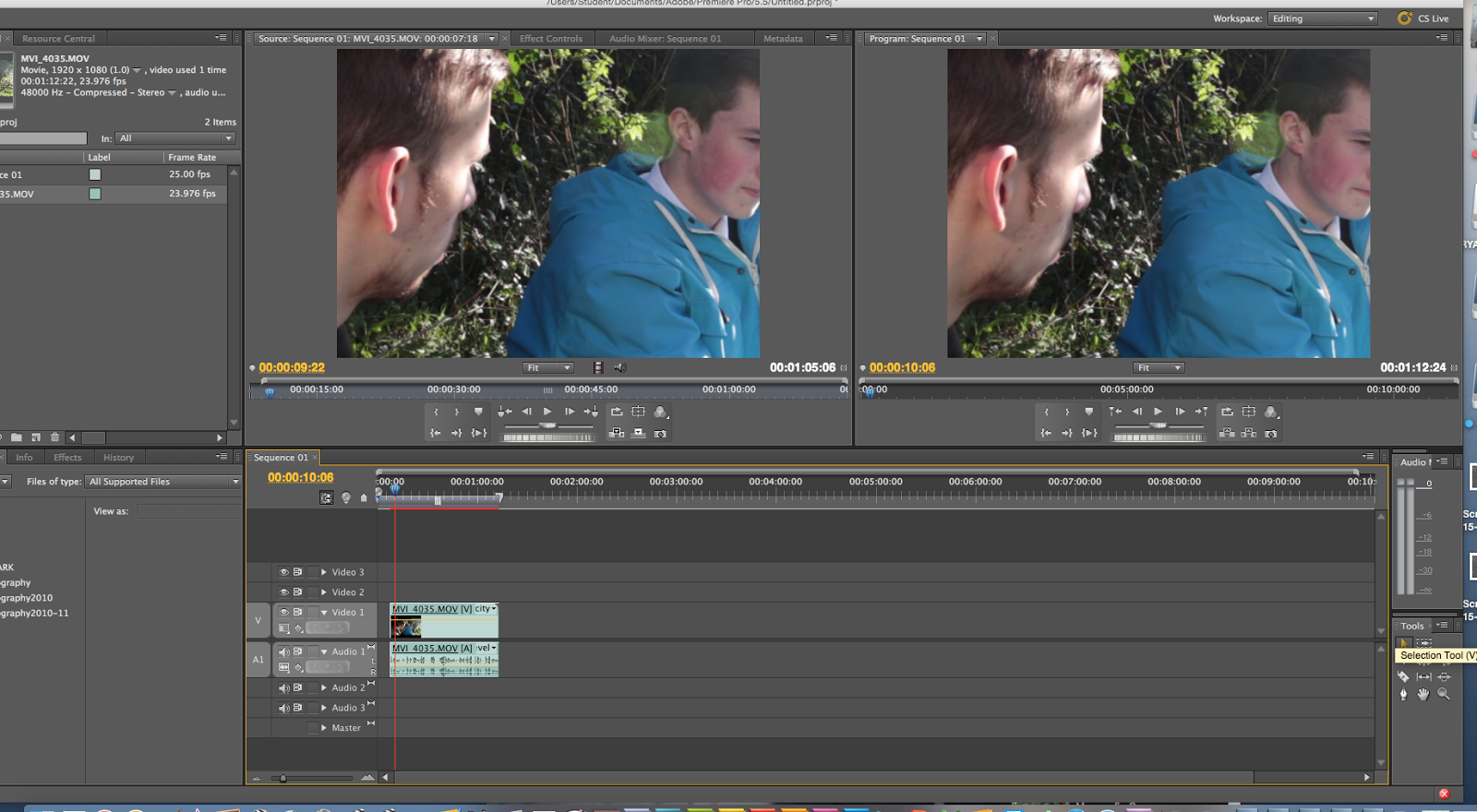
When starting to edit the first thing I did after importing the film clip and putting it onto the time line was to go onto the razor tool, this allowed me to separate parts of clips and then by selecting the selection tool I could click on a clip I wanted to delete. By using the selection tool I could select the wanted area and then by pressing the backspace button I could delete the unwanted clip.
The two screen shots below show you me doing this very process.


The final thing that my group and I did
when editing was adding other clips or music on the same part of the timeline,
by this I mean we have the main timeline where we have the film itself, we
then had a selection above and below where we have the music which was playing
at the same time as the film, we also had other video above the main time line,
for example this meant we could quickly switch from a medium shot to a close up
of a actor, the only problem with doing this though was instead of moving the camera
to the shot you wanted while filming you did
have to go over the same scene a couple times, however in the long run this does
not really matter as it has meant we have finished with a more professional end
product.
Reflection Process:
The reason why I think my poster worked well is because:
When starting to edit the first thing I did after importing the film clip and putting it onto the time line was to go onto the razor tool, this allowed me to separate parts of clips and then by selecting the selection tool I could click on a clip I wanted to delete. By using the selection tool I could select the wanted area and then by pressing the backspace button I could delete the unwanted clip.
The two screen shots below show you me doing this very process.
After cutting out a section I also had to use the selection tool so that I could move the clips so there are no breaks in the timeline, if I didn't do this you would just have a black screen which most certainly does not look professional. Below I just a screen shot showing me doing the process of moving a clip.
Reflection Process:
When looking back over all my practical work, I think I have made two very successful products individually, the poster and double page spread and contributed to a good group film.
What I think works well about my two print tasks is that they advertise the film well and fit the genre conventions I looked at in my research.
The reason why I think my poster worked well is because:
- I have used the colours black and white which connote the genre and are featured on professional posters like the posters I analysed.
- I used a medium shot for the main image of Delcua and this follows conventions of film posters for films like shutter island because they also did medium to close up shot on their poster.
- I have put the film title in the bottom part of the poster in a fine typography style to show the genre and this follows conventions of other film magazines I have seen as they use similar typography style.
- I have put the names of the actors in the top part of the poster and this follows conventions of posters for films like shutter island which also did this.
- I put the credits and release date at the bottom which is a convention all film posters follow.
The reason I think my feature article went well is because:
- I have used a medium long shot for my main image that is on the left side of the double page spread. This shot is of Delcua and this follows conventions I saw in other double page spreads because normally they place the main image on the left.
- I included film reel with other pictures from the film along the bottom of both pages of the article.
- I have written a clear review that shows my personal opinions in a style that you often see in film magazine review articles.
- I have put my article on the right side of the page in two columns.
- I have used a colour pallet of black and white to connote the genre of the film the article is about.
- I have put the title in a larger font and positioned it at the top of the page and made sure the typography is right for the genre.
What I think went well with out short film was:
- The unique storyline we developed
- Following genre conventions
- Trying out interesting shots
- Getting the dialogue right
- Geting the sound right
- Creating a unique title
However, some things could have gone better like the setting choice and filming in the middle of the day, this was not the original plan but due to weather problems and actor issues we had to adapt the script to this and it does not really fit the conventions of our genre. I cannot help thinking this was a mistake because it does not make our genre clear enough as pathetic fallacy does not add to the mood.
What I think went well with out short film was:
However, some things could have gone better like the setting choice and filming in the middle of the day, this was not the original plan but due to weather problems and actor issues we had to adapt the script to this and it does not really fit the conventions of our genre. I cannot help thinking this was a mistake because it does not make our genre clear enough as pathetic fallacy does not add to the mood.
- The unique storyline we developed
- Following genre conventions
- Trying out interesting shots
- Getting the dialogue right
- Geting the sound right
- Creating a unique title
However, some things could have gone better like the setting choice and filming in the middle of the day, this was not the original plan but due to weather problems and actor issues we had to adapt the script to this and it does not really fit the conventions of our genre. I cannot help thinking this was a mistake because it does not make our genre clear enough as pathetic fallacy does not add to the mood.
Thursday, 19 March 2015
Final Feature Article Draft
Deluca is a British short film that has met with mixed
reactions from viewers and critics due to director Alex Prynne’s controversial
decision to burn a Bible within the first two minutes of the film. Seen in
context it is easy to see how this decision fits the narrative but like with
anything that touches too closely on religion it was always going to get some
Christians hot under the collar. And it is not just the burning of the Bible
following an interesting animation sequence that brings to life the first
murder depicted within its pages that has offended some religious viewers, the
themes and narrative of this psychological thriller have also stirred up mixed
reactions as murder, sex outside of marriage and homosexuality are dominating
themes.
Controversy aside, the film has a lot going for it. The
cinematography, sound and editing by; Alex Prynne, Ryan Clark and Dan Goward
creates a dark tense mood through out the piece making this both gripping and
artistic. While Jess Dootson’s animation artwork adds an additional dimension
to the visuals of this film.
In terms of narrative, writer/director Alex Prynne has
certainly proved he is a future talent to watch out for as this piece, set
within the dark back streets of a poverty stricken small Cornish town, tells
the intense story of Delcua played by Travis Brown, who is torn between two
lovers, his girlfriend Sarah, played by Rose Harris and his controlling male
lover Hugo, played by Ryan Hearn and leaves viewers on the edge of their seats
and intellectually challenged.
The narrative starts with the dramatic murder of Sarah by
Delcua only for a number of strange and unexpected twists to then occur before
the film concludes. In short, this is an intelligent, clever story focusing on
inter guilt and betrayal brought to life by three talented young stars making
their big screen debuts.
Speaking exclusively to FilmFreak, Director Alex Prynne said
of the controversy; “I did not set out to offend people (laughs)…I am quite
surprised people were so offended by it. There are no laws against doing it and
it certainly fits in with the narrative because I wanted people to link the
themes of the film with the themes of some biblical stories to give it an extra
hard hitting dimension. This creative choice was also perhaps heavily
influenced by my interest in Mexican short films/animations because a lot of
these feature animations with a religious message.”
In a nutshell, this film is hot property and definitely
worth a watch when it is screen at Bodmin Town cinema later this month. If you
miss this screening, you can always find it online at on are YouTube channel or
catch it at the Cornish Film Festival next October.
feature article construction
For the first step I opened up a Photoshop document and then used the paint bucket tool to make a black background.


As you can see above the next thing I did was get a film reel image, once this was done done I put in scanned images of the drawings (used in the burning of the bible section) in each part of the film reel so that it looks like the screen shot above on the right.

For the next step I started to add text, I used American Typewriter typography for the masthead to make the masthead I used InDesign. One of the main reasons I used InDesign was the American Typewriter typography is not have available on my version of Photoshop. InDesign also helped me add a thick line under the text, I also used tools such as the transform tool which helped me add my own twist onto the text, I also made the text bolder however in thickness not size on InDesign and having done that I saved the text and put it onto Photoshop adding it on my feature article, however for my feature article I just used a simple Myriad Pro typography text as I believed it fits well into conventions of feature articles I have looked at.

Once having done this step I got a screen shot of the bible burning and put that under the first section of the feature article. The reason for doing this was so I could break up the article.

Next I added in the final parts of feature article as you can see above and took a quote from the article and put it in-between a part of the article, by doing this I could break up the article so the feature article looks more attractive.


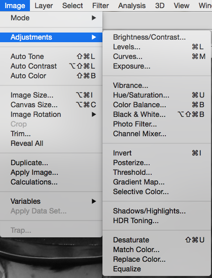
For the next step I put this image above of the main character Delcua on the Photoshop document. Bbefore doing anything with it I first of all cropped the image so the image went from a medium long shot to a medium close up shot. I then went image>adjustment>black and white to make the image black and white.

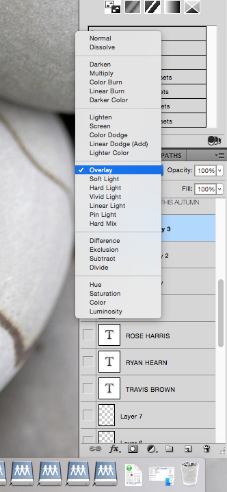
For the next stage I went onto brusheezy and got a smoke brush once I downloaded the brush I used a overlay texture to go over the image of Travis playing Delcua. On the brush layer I also turn the opacity down to 67% so it became transparent I changed the fill to 86%. I also in this step used the rectangular marquee tool to make a border for the burning bible.

To finish of the feature article I add in some text to go above the image which just tells you who is in the image and who he is playing, this is a common convention I found when looking at other double page film articles, I also added text in the top left corner to just show the title of the magazine.
Monday, 23 February 2015
Poster construction post
 Step 1) I added the image of Deluca on a new Photoshop document (a4) next I went onto image> adjustment> black and white so I could make the image black and white to follow the colour pallet I have seen of similar genres.
Step 2) I put the images of the cut out hands on the same Photoshop document which I cut out with the quick selection tool and for the next step I repeated the black and white step on the previous step.
 Step 3) I went onto a new layer and then used the gradient tool and changed the layer options to overlay I repeated this step twice having one gradient going from left to right and the other going top to bottom.The reason for doing this is because I wanted to darken the image so it fitted more into the conventions I had seen for a psychological thriller.
Step 4) For this step I made the text for the masthead, I decided not to use the one I already made because it just did not fit into the style of poster I had created, after doing a survey monkey less people liked that masthead over the final one I created anyway. To start of the masthead I choice my typography style and then changed the settings in the screen shots below on the text layer.


Step 5) To finish of the text I went onto brusheezy where I downloaded a free smoke/fire smoke effect which I used as a over layer effect on the masthead. The reason for doing this was to had a sense of contrast to the text so that I had the text but also this visually interesting effect on top of it.

Step 6) For one of the final steps I went onto brusheezy again however got a crack and moss texture effect brush which I like and with the text used as a overlay effect, the crack effect I used on the hands and moss effect on the hat to add a more vintage style to it.I also used the crack effect on the hands so that it made the poster more visually pleasing, I also thought it made the whole poster standout a lot more and this is a key feature that you want you poster to do as you want people to see it and if it does not stand out people will just walk past the poster taking no notice.
Step 7) For the final step I added all of the text such as the actors names on the top part of the poster and the film credits in the bottom half following conventions of most film posters.
Below is the final poster

Wednesday, 21 January 2015
Cast and Equipment list for the poster and feature article photoshoot
Here are three separate lists, the first one is for the models that we need for the poster and feature article. The second list includes all the equipment my group will need while doing the photo-shoot and then the third list is the props list.
Cast/Models
Travis Brown (Delcua)
Rose Harris (Sarah)
Equipment
 Lighting equipment
Tripod
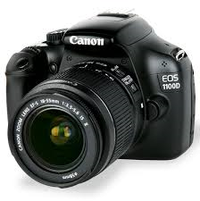
Cannon 1100D
Black background
64gb memory card
Props
Balloons
Costumes - black to match the genre
Thursday, 15 January 2015
Poster text construction
For the first step of constructing my text I opened up a Photoshop document and made the document black with the paint bucket tool. Next I selected the text tool a used it to write Deluca on the black document.
Next I go up to the Image menu at the top of the screen, choose Rotate Canvas, and then choose 90° CW. For the next step I go up to the Filter menu at the top of the screen, choose Stylize, and then choose Wind. After effecting this setting the text looked like the screen shot below.


For the next step I rotate the text again by going back up to the Image menu, choose Rotate Canvas once again, and this time, choose 90° CCW. So it looks like the screen shot below.
 Next I go up to the Filter menu at the top of the screen, choose Blur, and then choose Gaussian Blur and then change the radius to 1.2. After that I then go onto the liquefy setting and use it to expand the wave effect after that step the text looks like the screen shot below.

Before the next step I duplicated the text layer after that I go onto the hue saturation setting and set the Hue value to around 40 for a warm yellow/orange colour, then crank the Saturation value all the way up to 100 to really boost the colour's intensity. I then go onto the hue saturation setting again and set the Hue value to around -15 for a deeper orange colour, for the next part I go onto the layer setting and put it as overlay, after that the text looked like the screen shot below.


Next I repeat the last step two more times so that the wind effect becomes more dominate (shown in the image below).
For the next step I rotate the text again by going back up to the Image menu, choose Rotate Canvas once again, and this time, choose 90° CCW. So it looks like the screen shot below.
Before the next step I duplicated the text layer after that I go onto the hue saturation setting and set the Hue value to around 40 for a warm yellow/orange colour, then crank the Saturation value all the way up to 100 to really boost the colour's intensity. I then go onto the hue saturation setting again and set the Hue value to around -15 for a deeper orange colour, for the next part I go onto the layer setting and put it as overlay, after that the text looked like the screen shot below.
Next I used the gradient tool on a new layer, having done this I then used the settings below.
Having done that I have the final text which is shown below.
Subscribe to:
Comments (Atom)