 Step 1) I added the image of Deluca on a new Photoshop document (a4) next I went onto image> adjustment> black and white so I could make the image black and white to follow the colour pallet I have seen of similar genres.
Step 2) I put the images of the cut out hands on the same Photoshop document which I cut out with the quick selection tool and for the next step I repeated the black and white step on the previous step.
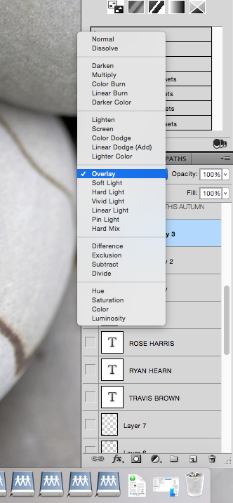 Step 3) I went onto a new layer and then used the gradient tool and changed the layer options to overlay I repeated this step twice having one gradient going from left to right and the other going top to bottom.The reason for doing this is because I wanted to darken the image so it fitted more into the conventions I had seen for a psychological thriller.
Step 4) For this step I made the text for the masthead, I decided not to use the one I already made because it just did not fit into the style of poster I had created, after doing a survey monkey less people liked that masthead over the final one I created anyway. To start of the masthead I choice my typography style and then changed the settings in the screen shots below on the text layer.


Step 5) To finish of the text I went onto brusheezy where I downloaded a free smoke/fire smoke effect which I used as a over layer effect on the masthead. The reason for doing this was to had a sense of contrast to the text so that I had the text but also this visually interesting effect on top of it.

Step 6) For one of the final steps I went onto brusheezy again however got a crack and moss texture effect brush which I like and with the text used as a overlay effect, the crack effect I used on the hands and moss effect on the hat to add a more vintage style to it.I also used the crack effect on the hands so that it made the poster more visually pleasing, I also thought it made the whole poster standout a lot more and this is a key feature that you want you poster to do as you want people to see it and if it does not stand out people will just walk past the poster taking no notice.
Step 7) For the final step I added all of the text such as the actors names on the top part of the poster and the film credits in the bottom half following conventions of most film posters.
Below is the final poster

No comments:
Post a Comment