Friday 29 November 2013

Masthead experiment

For this masthead experiment I did a Top Of the Pops inspired masthead.
1) For the first step I wrote the text Top Pop in big text in the center of a A4 photoshop page.
2) For this step I went back to the background layer and made it a bright blue colour following the convention that the pop genre uses very bright colours. 
3) Moving onto step three I started of by using the Elliptical Marquee Tool and then the paint bucket tool to make a white circle, I then put the circle in between the text Pop Top. 


4) For step four I used the Horizontal type tool to put the text from the inside the circle.


5) For the finale step I got the image of a star and then made a border of stars around the text to finish of the masthead.

Masthead Experments


For my masthead I started of by getting this text style text from free urban fonts I then put it into photoshop so it was ready for the next step.
I then got a image of an emoticon and put it on to photoshop.


For next stage I put the emoticon inside the o in pop the reason. I did this is because it resembles the target audience as the young people of today are stereotyped of being attracted to there mobile phones.


For the next part of my masthead I took a screen shot of my phone text messaging screen.I then used the brush tool to paint over the contact information and the text message I sent.


For the next stage I put the social pop text onto my phone screen shot image.


For the next stage I deleted the keyboard. I was going to use this as my masthead however it was to big so I decided to cut out everything around the speech bubble.


After deciding to cut out the speech bubble and leave a little black around it to make the speech bubble stand out a little. This was my finale masthead.  

Friday 22 November 2013

Planning my Photoshoot


When doing my photo-shoot I will need to get at least five pictures suitable for my three pieces of work. I will most likely need to use more than five images because a lot of pop magazines use over five images just on the cover page.

Short list
Medium shot of male singer for font cover.
Two medium shots of two different boy band members. 
Medium shot of the boy band for contents page.
Medium shot of the boy band for feature article page.
Four medium shots of each member of the boy band.

Location list
Cover= in photo studio with a blue backdrop and white backdrop.
Contents= in photo studio with blue backdrop.
Feature article= in photo studio with blue background.

Cast list
Teenagers around the age of 16 to 17 to be the boy band.
A teenager around the age of 17.

Crew list
Myself (Ryan Clark)

Equipment list
6D Canon SLR
50mm Lens
Tripod
Light kit
64 GB memory card
Photoshop
InDesign
Clothing
accessories such as hats
blue back drop
back drop frame
Mac
make up

Budget
Camera -  costs around £1200 to purchase camera or £50 per day to hire.
Lighting Kit - would cost around £120 to purchase.
Tripod -  To purchase it would cost around £30.
Photoshop -  for the best of photoshop it would cost £800 however you can get cheaper models.

InDesign- for InDesign it costs around £800
64GB Memory Card - can cost £70 to purchase or cheaper depending on make at where it is bought.
50mm Lens - the lens costs around £240 to purchase.

Clothing and accessories- will cost anything from £5 to £500 depending on the brand of clothing.
Blue back drop- this will cost around £5
Back drop frame- will cost £40
Mac- could cost £1,149.00 for the cheapest model or more.
Make up- will cost hair straighteners £30 lipstick £10 mascara £10 and other make up accessories it come to a total of around £50 plus.

Thursday 21 November 2013

Make a Masthead


To make the masthead above I started of by opening a A4 page in photoshop and using the paint bucket tool to turn the page black.


Next I added the letter P in front of the black background.
Next I typed the letter Pop into Google to get words that relate to it.I then added some of the words I found and put them on the right hand side.
For the next stage I simply added some more words that relate to the word  pop.

For the next step I went onto Brusheezy and downloaded a Smoke brush effect.


Next I went back onto Photoshop and downloaded the brush.


For the next step I used the paint brush tool to make this one big smoke effect on the P that you can see to the right. I chose the colour pink because it best relates too the target gender and age of people who read pop magazines.

For the final step I just add more words to the right hand side of the P to finish it the title.

Thursday 7 November 2013

Making a Masthead


Then reason I decided to make this masthead is it is like the Top of the Pops magazine and also relates to the theorist Bentley 1997 who said: "The making of the new though the rearranging of the old"I have also decided to make the masthead in a old school style stamp style because it relates to the target audience who are currently in school, this can be seen as a positive as it relates to the target audiences but also a negative as teenagers don't all ways like school so this could put people of.


The text above I did to get some ideas about what I want for my magazine masthead I started of doing a tutorial to learn some new photoshop keys.
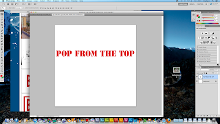
1) I started of by writing the text Pop from the top in the center of the page.
2) I then put a red border around the text using the rectangle tool.


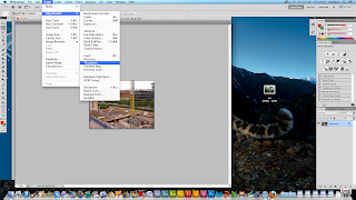
3) I then got a large image of a building site landscape with lots of lines and buildings.I then put the image on a different  photoshop file than the text.


4) I now go image>adjustment>Threshold from the main menu then a dialogue box should pop up. I then drag the slider nearly all the way to the left, leaving only the most prominent lines and details present lines and detail present.


                                                                                         After doing step four it should look something  like this.


5) I then selected the magic wand tool and clicked directly on the black parts of the image to expand the selection to all black you go select> similar.Now that all the black areas are selected you go edit> copy and edit> paste then move it over to the logo document.


6) For the finale step you go on the thumbnail in the layer palette with the mouse to select the pop from the top object. Then without losing the selected area you make the logo area active  and press delete on the keyboard. Now all you have to do is lose the selection so you hide/delete the pop from the top area.