Wednesday, 21 January 2015

Cast and Equipment list for the poster and feature article photoshoot


Here are three separate lists, the first one is for the models that we need for the poster and feature article. The second list includes all the equipment  my group will need while doing the photo-shoot and then the third list is the props list.

Cast/Models

Travis Brown (Delcua)
Rose Harris (Sarah)


Equipment

Lighting equipment
Tripod
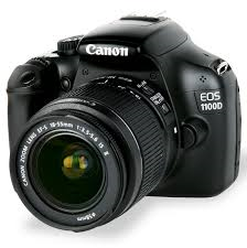
Cannon 1100D
Black background
64gb memory card

Props

Balloons
Costumes - black to match the genre

Thursday, 15 January 2015

Poster text construction

For the first step of constructing my text I opened up a Photoshop document and made the document black with the paint bucket tool. Next I selected the text tool a used it to write Deluca on the black document.

Next I go up to the Image menu at the top of the screen, choose Rotate Canvas, and then choose 90° CW. For the next step I go up to the Filter menu at the top of the screen, choose Stylize, and then choose Wind. After effecting this setting the text looked like the screen shot below.


Next I repeat the last step two more times so that the wind effect becomes more dominate (shown in the image below).


For the next step I rotate the text again by going back up to the Image menu, choose Rotate Canvas once again, and this time, choose 90° CCW.  So it looks like the screen shot below.


Next I go up to the Filter menu at the top of the screen, choose Blur, and then choose Gaussian Blur and then change the radius to 1.2. After that I then go onto the liquefy setting and use it to expand the wave effect after that step the text looks like the screen shot below.


Before the next step I duplicated the text layer after that I go onto the hue saturation setting and set the Hue value to around 40 for a warm yellow/orange colour, then crank the Saturation value all the way up to 100 to really boost the colour's intensity. I then go onto the hue saturation setting again and set the Hue value to around -15 for a deeper orange colour, for the next part I go onto the layer setting and put it as overlay, after that the text looked like the screen shot below.


Next I used the gradient tool on a new layer, having done this I then used the settings below. 

Having done that I have the final text which is shown below.


Thursday, 8 January 2015

Original Images


In the poster there is going to be photos from two different photo shoots, the first photo shoot it mainly made up of close ups
of Deluca and Sarah.

When doing the first photo shoot we had the actors wear black to fit the colour conventions of the genre. It also helps make the images more dramatic and show more of the emotions of the actors such as in the image to the light where she looks very serious. With the studio shots we also used black backgrounds to add to this.

I think the studio close ups came out really well as I got the lighting and focus right on all the images.


The medium close ups I took with the ballon did not come out as well as the backdrop was not up high enough and the yellow of the ballon reflected on the model. However, I shoudl be able to fix this because I want the image in black and white anyway so should be able to edit it. 

The final photo shoot was done in the lane where the film was set to show the setting. These medium close ups came out well because the pose of the model and setting creating a sense of mystery that I wanted for my images. The lighting could have been better but because it was outside it was hard to control but I will be able to edit these images to make them more interesting.


Wednesday, 7 January 2015

Final Actors and Crew

Final Cast:
Travis Brown as Deluca
Rose Harris as Sarah
Ryan Heanre as Hugo

Crew:
When looking at the crew sadly Dan Goward has dropped out of 6th Form this means that the crew will now only consist of myself and Alex Prynne.

Friday, 2 January 2015

Costume design sketches


Her are some sketches (bottom of the page) I have done of the clothing the actors will be wearing during the short film. For the short film I decided we would keep the clothing very simple I did this though use very simple colour such as black which is a colour used for a least one piece of everyone's clothing.  Sarah clothing  I decide to kept it very simple with a black t-shirt, jeans and black shows the reason for this very unadventurous clothing is because I did not wanted Sarah to look different instead I wanted her to look like a normal every day girl this was so the viewers could relate to her. This is a convention which I kept finding poping up in films of this genre, a film which I  can relate this to is Paranormal Activity where you have people like Diana a unknown actress in every day clothing which just makes you relate better to her below is a image of her in Paranormal Activity.

I also did the same thing with Hugo's clothing I did this though having him in a hoodie which stereotyped as a pieces of clothing for people around Hugo's age. Although for Deluca I made him have more adventurous clothing because he is the main character and I wanted him to be seen as different I did this though having him wear clothing such as a pea coat. A good example of this would be the swan queen in the Black Swan where the main character wears very unique style of clothing shown in the image below however you could argue that Deluca is a lot less extreme however this is just a convention which I have taken on board but put my own twist to it.